18. April 2016

Tabguard

react-tabguard (GitHub: avocode/react-tabguard, License: MIT, npm: react-tabguard)

A problem all of face at some point in our career is: A product owner who comes to you with the question to contain the Tab navigation to only one form. Something like this for instance:

There isn’t really an easy way to limit tabbing to a specified area inside your HMTL document. It’s not desirable to lose focus on the overlay window when tabbing. Luckily the some developer saw this and started working on React TabGuard to save the day.

Since there is not really an extensive API to discuss I will just give you with an example of how to use is:

import React from 'react';
import TabGuard from 'react-tabguard';

function App(props) {
  return (<div className="double-form-container">
    <div className="left">
      <TabGuard>
        <h1>Form A</h1>
        <input type="text" placeholder="Name"/>
        <input type="number" placeholder="Age"/>
        <button>Send</button>
      </TabGuard>
    </div>
    <div className="right">
      <TabGuard>
        <h1>Form B</h1>
        <input type="text" placeholder="Name"/>
        <input type="number" placeholder="Age"/>
        <button>Send</button>
      </TabGuard>
    </div>    
  </div>);
}
13. April 2016

Animated

Animated (GitHub: animatedjs/animated, License: MIT, npm: animated)

Animations have always being weak point React. After recognizing this problem, the community has put in a lot of effort to solve this problem. Tools like React Velocity, TransitionGroup etc emerged. But non of them are quit as flexible as the Animated library. Animated embraces the declarative aspect of React and obtains performance by using raw DOM manipulation behind the scenes instead of the usual diff.

The developer has posted some really nice interactive documentation which I recommend you give a look. As a quick example I will show you how the most complete example would work:

import React from 'react';

class MyAnimatedComponent extends React.Component {

  constructor(props) {
    super(props);
    this.props = props;
    this.state = {
      anim: new Animated.Value(0),
    }
  }

  handleClick(delta) {
    this.state.anim.stopAnimation(value => {
      Animated.spring(this.state.anim, {
        toValue: Math.round(value) + delta
      }).start();
    });
  }  

  render() {
    return (
      <div>
        <button onClick={() => this.handleClick(-1)}>&lt;</button>
        <Animated.div
          style={{
            transform: [
              {rotate: this.state.anim.interpolate({
                inputRange: [0, 4],
                outputRange: ['0deg', '360deg']
              })},
            ],
            position: 'relative'
          }}
          className="circle"
        />
        <button onClick={() => this.handleClick.bind(this, +1)}>&gt;</button>
      </div>
    );
  }
}

11. April 2016

proptypes-parser

proptypes-parser (GitHub: joonhocho/proptypes-parser, License: MIT, npm: proptypes-parser)

When working in in React and you are following the guidelines on how to create components, you’ve probably already ran into the frustration of constantly saying PropTypes.number, PropTypes.string, PropTypes.func etc. Personally I do not like to write all this repetition. So I could do something like this:

import { PropTypes } from 'react';
const { number, string, func, shape, /* etc */ } = PropTypes;

But that does not really work, since I would need to do that on top each file.

proptypes-parser lets you define your PropTypes in a GraphQL-like syntax, like so:

const propTypes = parsePropTypes(`{
  number: Number
  string: String!
  boolean: Boolean
  function: Function!
  date: Date!
  object: Object!
  shape: {
    nested: Number
    array: [Number]
    must: Boolean!
  }!
  array: [Number!]!
  arrayOfObjects: [{
    value: String
  }!]
  node: Node
  element: Element!
  message: Message!
  any: Any!
}`);

It also allows you to define your own custom PropTypes like so:

const parsePropTypes = createPropTypesParser(PropTypes, {
  Message: class Message {} // To use 'Message' type is PropTypes.
});

For further documentation and examples take a look at the README file.

06. April 2016

React Storybook

React Storybook (GitHub: kadirahq/react-storybook, License: MIT, npm: @kadira/storybook)

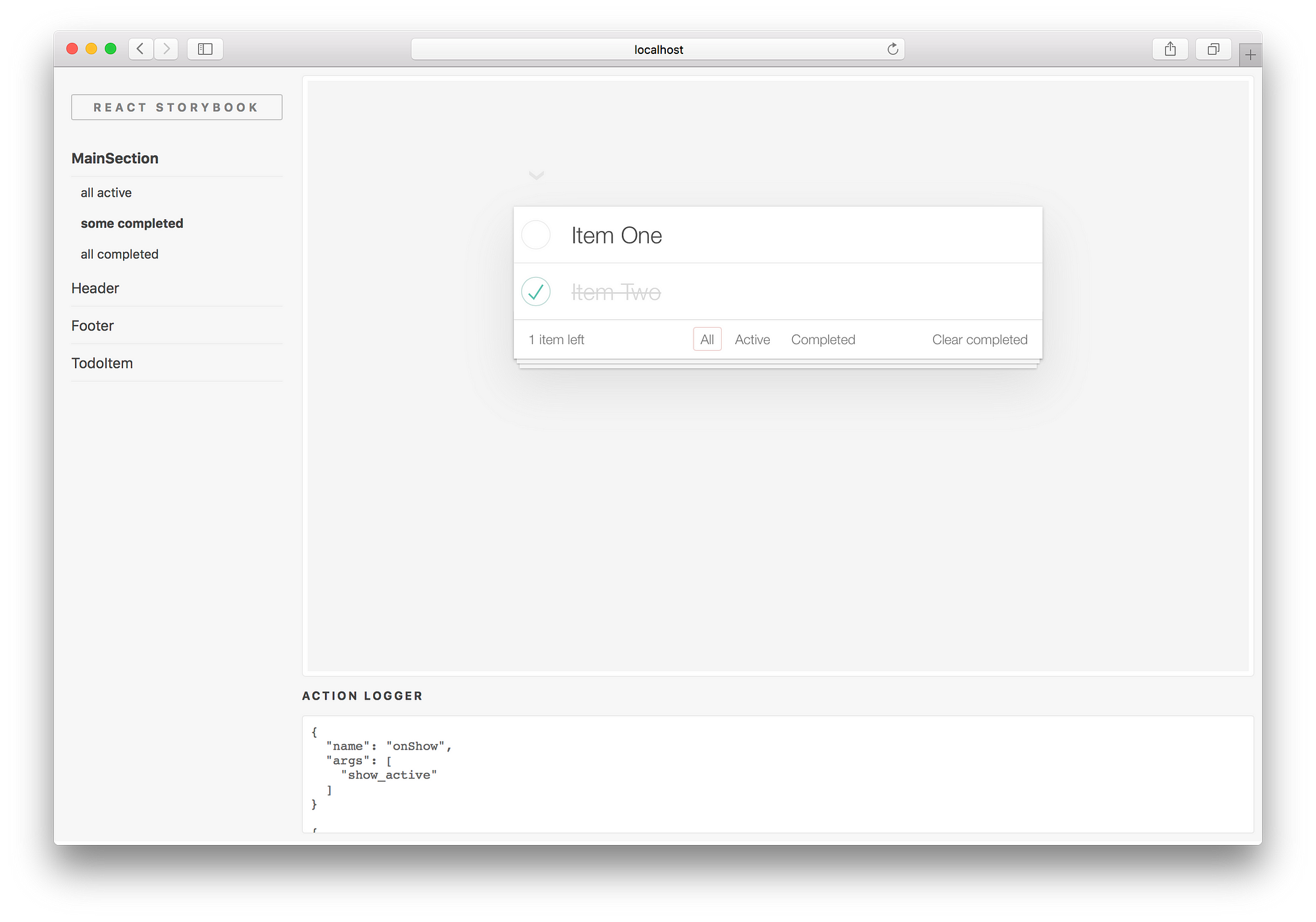
After having worked on several React projects, I started noticing that in reality it’s still hard to keep your components completely contained. So when, few days ago, I came across “Introducing React Storybook” I was really intrigued by this approach to developing your components.

Storybook

With React Storybook, you can develop and design UI components outside your app in an isolated environment. Once you’ve installed it using:

npm i @kadira/storybook

You will need to add a storybook run script in your package.json like so:

{
  "scripts": {
    "storybook": "start-storybook -p 9001"
  }
}

Now you can start writing stories. There are some guidelines on how to write stories which also enforce a clean way of working in general. For a component like this:

import React from 'react';

function MyAwesomeButton(props){
  return (<button onClick={props.onClick}>{props.title}</button>);
}

Would look something like this:

import React from 'react';
import MyAwesomeButton from '../path/to/MyAwesomeButton';
import { storiesOf, action } from '@kadira/storybook';

storiesOf('Button', module)
  .add('with a text', () => (
    <MyAwesomeButton onClick={action('clicked')} title="My Awesome Button" />
  ))
  .add('with no text', () => (
    <MyAwesomeButton />
  ));

05. April 2016

React Native, Vector Icons

Vector Icons (GitHub: oblador/react-native-vector-icons, License: MIT, npm: react-native-vector-icons)

Icons are all around us. We encounter them in the real world every day. They can communicate a message by association instead of by text. This is very useful ‘cause sometime you will only have enough space for a little image, but you still want to explain or communicate with the consumer of your product.

This is the reason that designers prefer icons over text to indicate user interactions. In modern web there are multiple approaches to loading and rendering of these icons.

  • We could require them in the form of a font in which each character is set to an icon instead of the letter character.
  • We could load them in directly as an SVG and use this on the page.
  • We could use an SVG as a background-image in our CSS and show.

But what if we don’t have a CSS or HTML, like in React Native? Then we have a problem. There are multiple ways to include images and SVG’s into a native application but this requires some knowledge of the native platform and is also very labor intensive because every time you want to an icon you will need to import it into your project.

To solve that problem react-native-vector-icons was created. It allows you to import icons very easily into your React Native project. When installed you have more than 3k of icons to choose from originating from icons sets like Entypo, FontAwesome, Foundation, Ionicons, MaterialIcons, Zocial and more.

Unlike most libraries that I’ve seen for React Native, it supports Android and iOS. Once you have installed it and configured react-native-vector-icons via the instructions in the README, you can use it in your components like this:

import Icon from 'react-native-vector-icons/FontAwesome';
const rocket = (<Icon name="rocket" size={30} color="#900" />);

Since icons often get used inside buttons the developers included an easy way to create basic buttons:

const defaultButton = (
  <Icon.Button name="facebook" backgroundColor="#3b5998" onPress={this.loginWithFacebook}>
    Login with Facebook
  </Icon.Button>
);

const customTextButton = (
  <Icon.Button name="facebook" backgroundColor="#3b5998">
    <Text style={{fontFamily: 'Arial', fontSize: 15}}>Login with Facebook</Text>
  </Icon.Button>
);