@kadira/react-storybook-addon-info (GitHub: kadirahq/react-storybook-addon-info, License: MIT, npm: @kadira/react-storybook-addon-info)
In April I did a mention of React Storybook.
If you are not familiar with Storybook yet, it provides you with an isolated environment to create your React components in.
Over the past couple of months there has been a lot of development on the project, like patching bugs, adding features and one of the most amazing things about the new version is the add-on support.
There have being a few add-ons created already, but today we will be having a quick look at the react-storybook-addon-info.
The info add-on let’s you use React Storybook as a living style guide with usage documentation.
When using propTypes or defaultProps it will pick them up and present them in a table so you have an overview of whats possible with the component.
Reminder: A normal story looks like this:
 storiesOf('Button')
   .add('without text', () => (
     <Button onClick={action('onClick')} />
   ));
Once react-storybook-addon-info is configured it will provide you with the addWithInfo function on the storyOf object, which can be used like this:
storiesOf('Button')
  .addWithInfo(
    'without text', // Name of the state
    'The Button rendered without any text.', // description
    () => (<Button onClick={action('onClick')} />) // Your component
  );
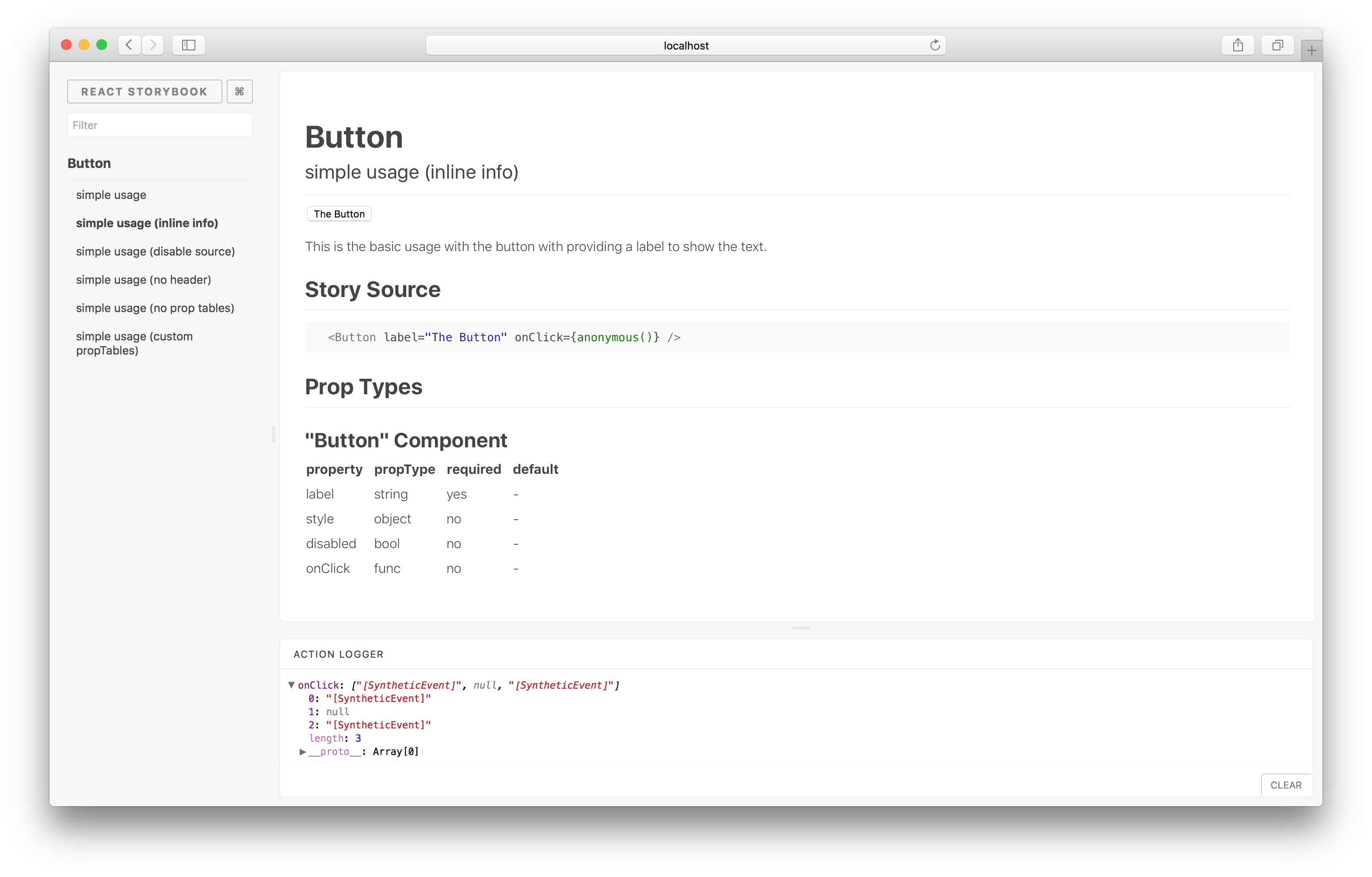
This will give you a [?] in the top right corner of the Storybook preview. Once you click that you will be presented with a page like this:
For more information and demo’s on how to use this check out the README